
The “state of TLV” is a widely used phrase in Israel. Ask the average Israeli and he’ll tell you that everyone in TLV are left wing voters and we all eat sushi all day. That, of course, is far from the truth, but gives an opportunity to look at this theory from a more mathematical approach.
While many infographics were made on the different voting trends in Israel (per area, per socio-economic decile, …), I wanted to see whether the best partition of the country to cantons will result in a canton that surrounds Tel Aviv or is it small enough to be absorbed in the “general center of Israel”. In a way, I’m looking on the same problem from the opposite direction - instead of comparing statistics and showing that Tel Aviv is different from the surrounding cities (which is true and easy to observe), I want to find the best clustering of the country and see if Tel Aviv gets its own cluster. If so, I’ll consider it as a strengthening to the argument that the “state of TLV” exists.
One can think of many approaches for this clustering problem. For the purpose of this post I’ll try to cluster the points with a greedy algorithm. Both because it’s easier and in order to have a benchmark for other techniques that will follow later.
Thanks and credits
The last Knesset (parliament) elections were just a week ago and surprisingly a file with detailed data on the ballots and vote counts was published a few hours after the ballots closed (and was updated live for the next few days). Way to go!! The raw data and some statistics are available in the votes20.gov.il website.
The whole idea came from a data-hackathon that was organized by the Data Science Tel Aviv meetup group. While we had some time constraints during the hackaton and only managed to scratch the surface of this problem, I allowed myself to wait for the real results and spend a few weekends on that. Special thanks go to my group members: Ido Hadanny, Shay Tsadok and Hila Kantor for a great Friday morning, to Yair Chuchem for helping me with finding a file with ballots exact addresses and to Yuval Gabay for many ideas along the way.
The data
Generally, data files used in this post can be found in this GitHub repo and the code is shared through this iPython notebook.
As mentioned before, the election results, broken down by ballots, can be downloaded here. The downloaded file had some UTF problems, but after overcoming these, I’ve created a valid tab-delimited file (raw-votes-19.txt). In addition, I’ve added some calculated columns to make work easier.
Geo-location
The Google Geocoding API helped me with the extra mile to the ballots_locations.txt file that has a geo-location (long,lat) for every ballot. Another file with geo-locations for each city in the data file is cities_geo.txt.
Some ballots are “external votes” (votes of people that didn’t vote at their original ballot, mainly because they are soldiers, were on duty on the elections day or have an official position abroad (diplomats)). These are around 3% of the ballots and 5% of the valid votes. For all those, since we can’t have a “real” geo-location, I’ve randomly assigned a location of another ballot so they should be spread all over.
Calculating the “side-score”
For the simplicity of this post, I’ve assigned all parties to a Right/Center/Left group. Every ballot is then given a score between 0.0 to 1.0 that represents it’s location on that axis (0.0 represents left parties, 0.5 is the center and 1.0 goes to right wing parties). The mapping of parties to ‘sides’ is in the parties_mapper.txt file.
This is an obvious misrepresentation of reality. We have around 25 parties in Israel and they can’t all be projected on a single axis. Two parties might share the same opinions on the country’s foreign relations strategy but hold opposite opinions on economical issues. A future post will probably rate all parties on many axes and try to find clusters based on that data. For now, we’ll stay with a single score per point, representing the range between left and right.
Columns
- City name
- City ID
- Ballot ID
- Number of registered voters
- Number of actual votes
- Number of invalid votes
- Number of valid votes
- Number of votes every party got - multiple columns (per party)
- long/lat - the geo-location of the city
- votes_L/votes_C/votes_R - votes count per side
- side_score - an aggregated score (0.0-1.0) per ballot
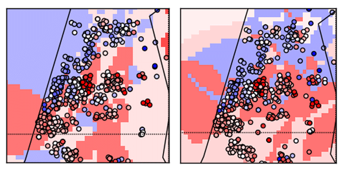
Visualizing the data
Just for a general orientation, I went with the American color scheme (Republicans=red, Democrats=blue) so the red color represents right wing parties (score close to 1.0) and the blue goes for the left wing parties (score close to 0.0). Score of 0.5 (center parties) are represented with a white circle.
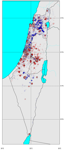
The simplest scatter of the ballots on a map will show us some expected results - Jerusalem and the “Judea and Samaria” villages tend to be significantly right-wings, that also applies for Ashdod and Ashkelon on the coastline and the Shfela area. We can also see clear red areas around Kiriat-Gat, Sderot, Netivot, Ofakim and Beer-Sheva. Not much of a surprise for the Israeli readers. Left wing areas are around the triangle villages, the Galilee and the Bedouin tribes around Beer-Sheva.
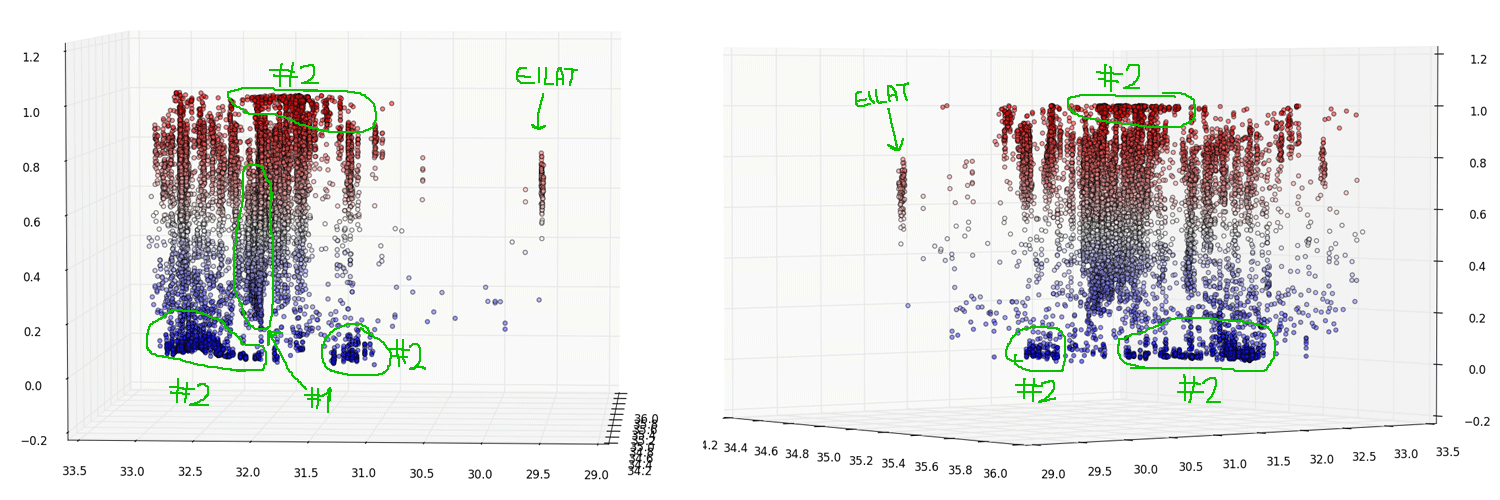
A 3D visualization will discover some more interesting observations:
-
The city of Tel Aviv. We can see an indication that supports the initial hypothesis that it behaves differently from its surroundings. The cities on its right are Rishon-Lezion, Rehovot and the whole Shfela area, and they clearly tend to the upper parts of the map while the Tel Aviv “ballots cloud” is pulled down a bit (having its mass around the center and certainly contains blue dots that the other don’t have).
-
Areas of homogeneous votes. Both in the Jerusalem and Judea and Samaria area to the right, and in the desert, the triangle villages and the Galilee to the left (as we’ve seen before).
Defining the problem
If we get out of the ballots and elections world, what we actually have here is a set of points with (long,lat) and a score attached to each one. We are trying to assign each point to a cluster such that:
- Every cluster is homogeneous (as much as we can) - the average standard deviation of the cluster scores is minimal.
- Clusters are “geographically close” - we can give some mathematical constraints on that, but I’ll keep it simple and use this as a guideline while designing the greedy algorithm. Other approaches (that will come in future posts), might treat this constraint differently.
Generally speaking, we could define an objective function based on these two measures and approach the whole problem as an optimization problem, looking for the clusters assignment that will minimize the function. I wanted to start with a greedy approach for this post, but going forward, I’ll will probably spend some time on other approaches as well.
The more clusters we break the dataset into, the smaller AVG(STD) we’ll get. Eventually, if every point is in its own cluster, we get AVG(STD)=0. So, in order to agree on some basic rules - I’ll define a valid solution to have at most 8 clusters (rule of thumb, you could run the same experiment with more or less clusters).
Benchmark - A simple KMeans clustering (geographical only)
Before introducing the greedy algorithm let’s measure some statistics on the data and use a simple KMeans clustering on the (long,lat) space to have a benchmark for comparison.
Statistics
avg/std is weighted by the number of votes per ballot
- side_score mean -
0.579 - side_score std -
0.284
KMeans results
I’ve used KMeans with K=8, without adding the side_score as another dimension. I did however test 2 different spaces for the points. One is the regular (long,lat) space, the other is the distance-from-major-cities space where every (long,lat) point is converted into the distance from Tel Aviv, Jerusalem and Haifa. Hopefully that would give more “natural” clusters.
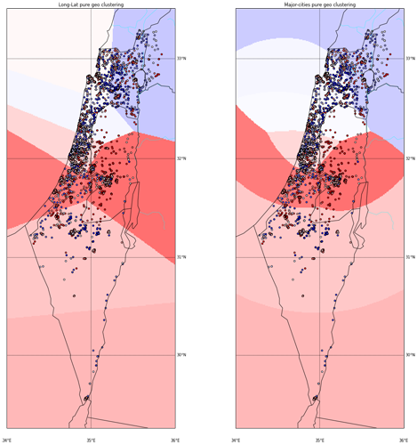
The plot above shows the KMeans results. The background color is the average score in each cluster. From the two options above, I think I like the ‘major-cities-distances’ space more, although I agree the difference isn’t that big. I’ll run the rest of the exercise on both spaces to see if that makes any difference.
While we didn’t take the side_score into account while clustering, we do know that tendency to left/right wing parties is, among other factors, geographically based so we can expect some improvement in the average STD of side_scores in the clusters. The results are:
| AVG(STD(side_score)) on all clusters | |
|---|---|
| (long,lat) space | 0.249 |
| major-cities-distances space | 0.251 |
Our worst STD (without clustering) was 0.284 so even pure geographical clustering seems to help.
The greedy algorithm
For efficiency, I’ve run this part on a 20% random sample of the ballots.
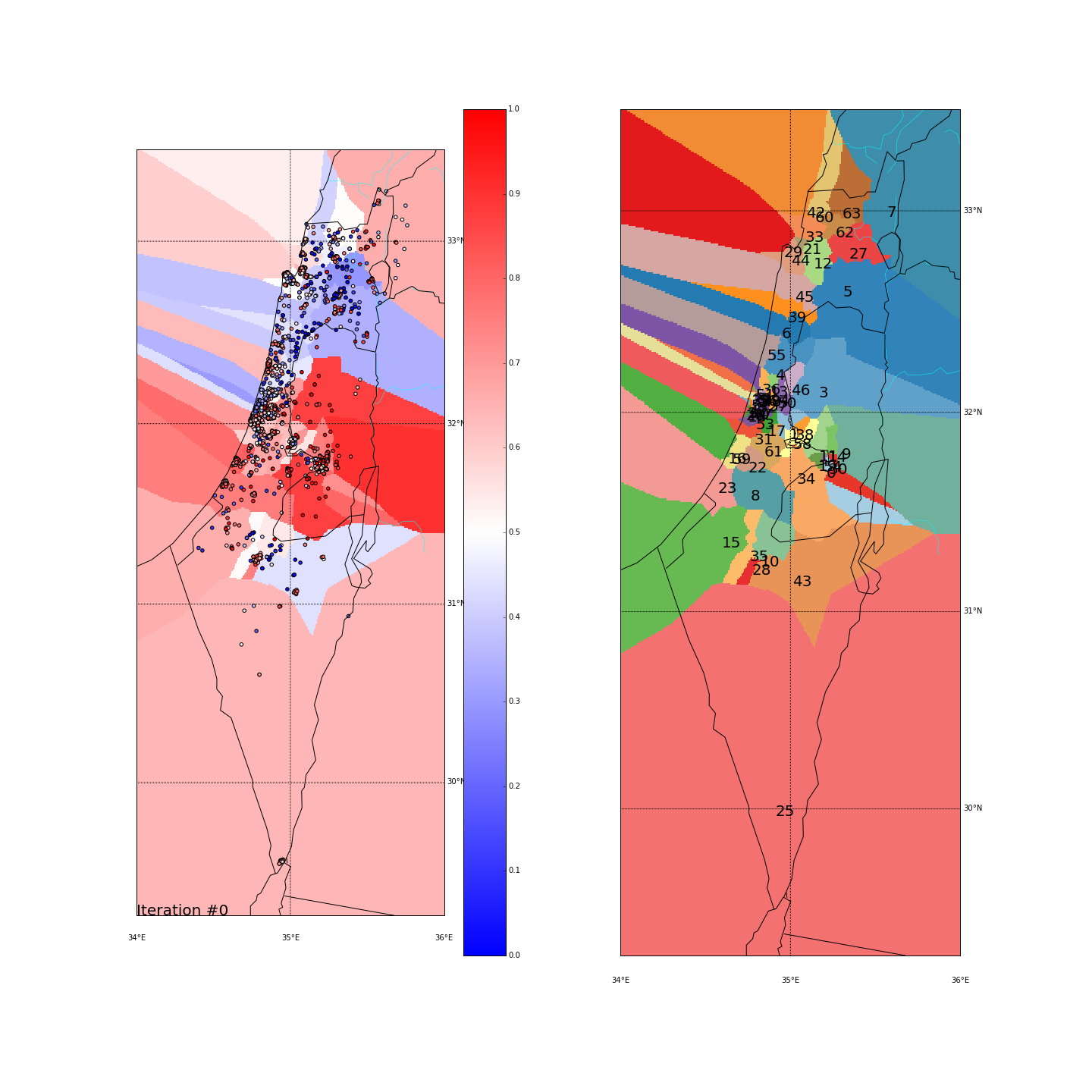
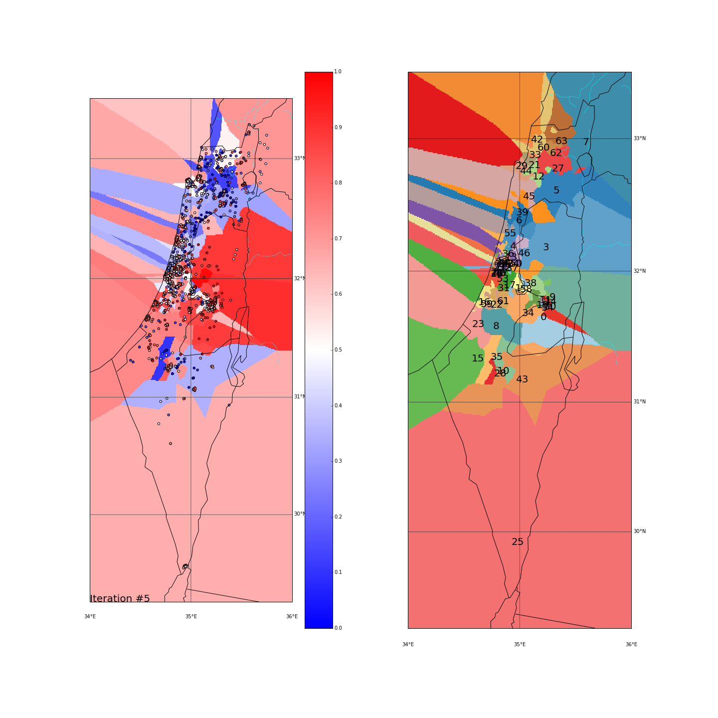
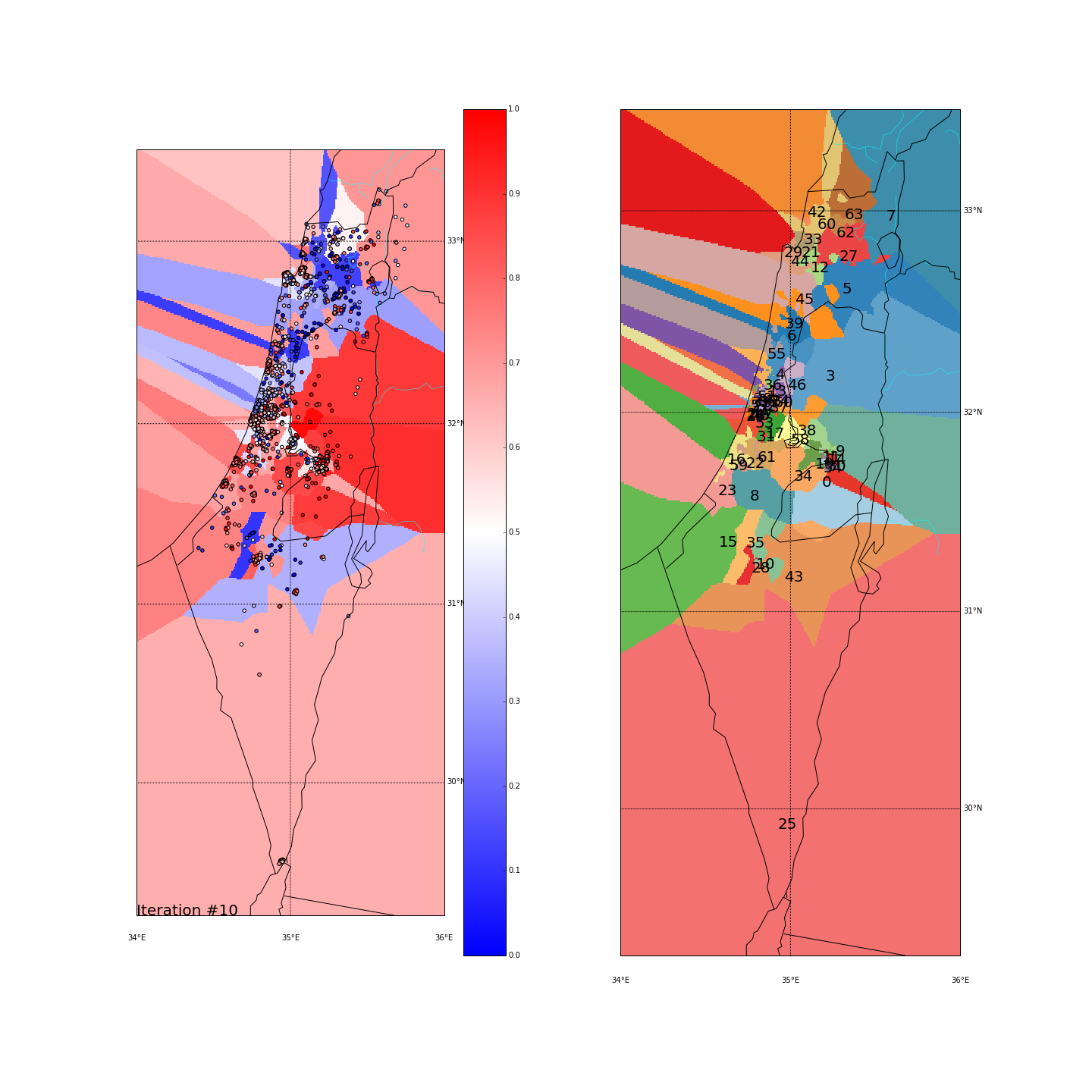
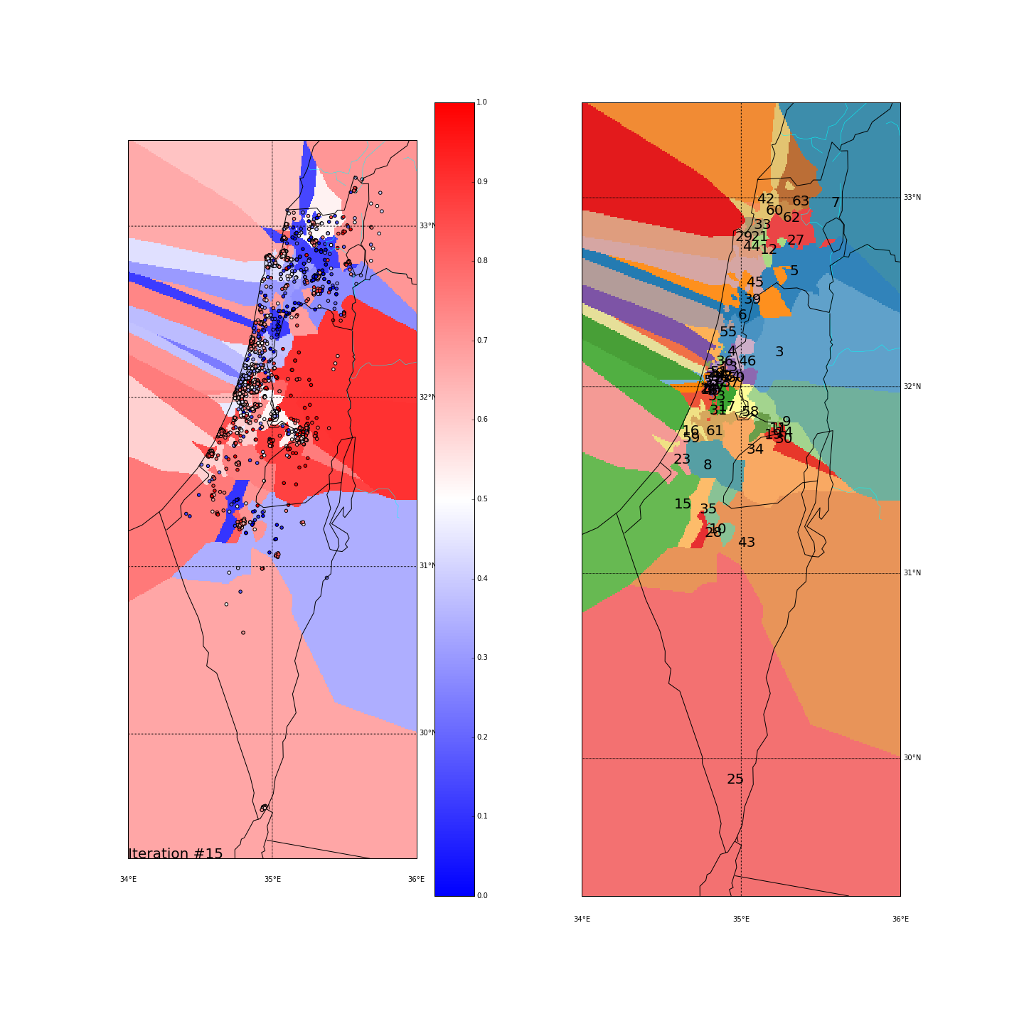
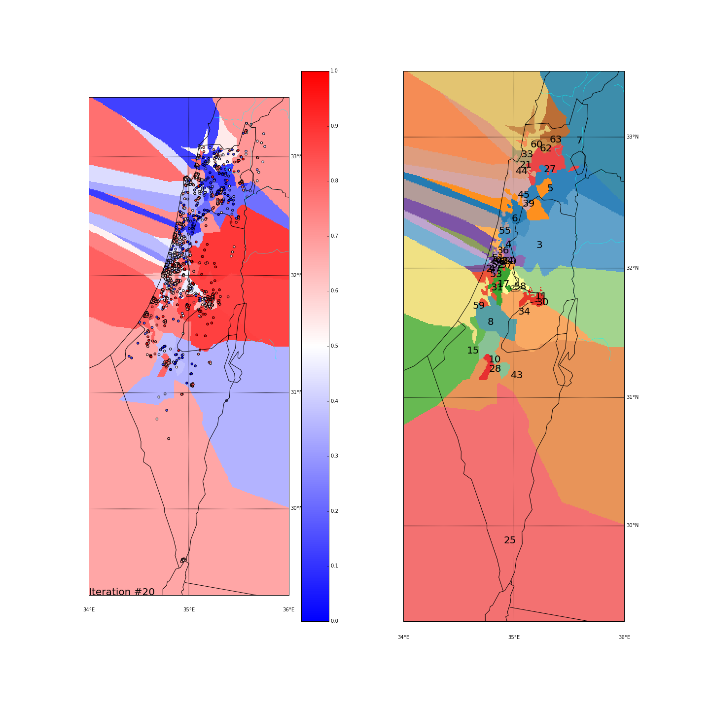
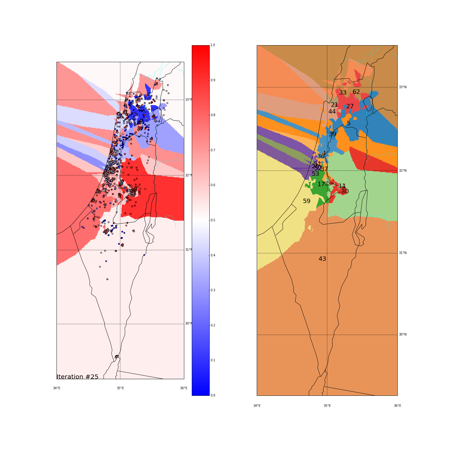
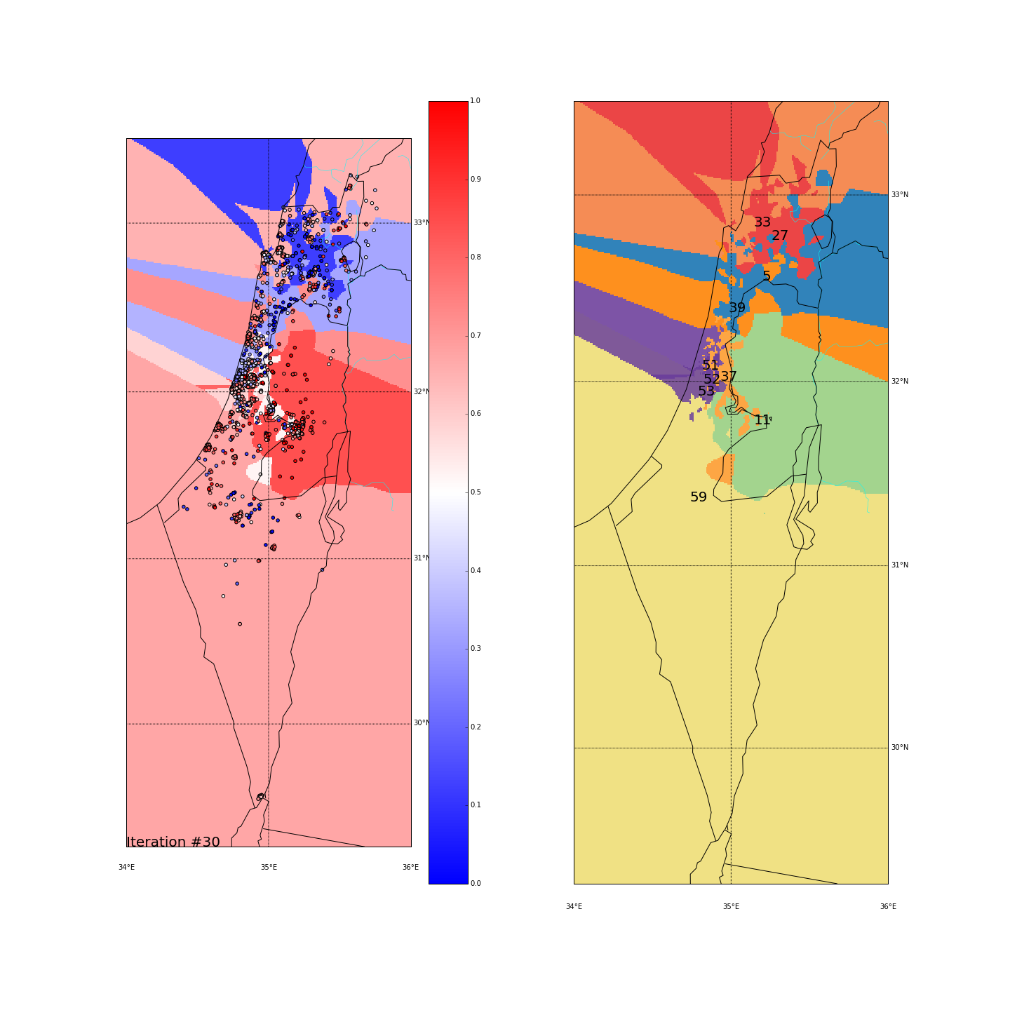
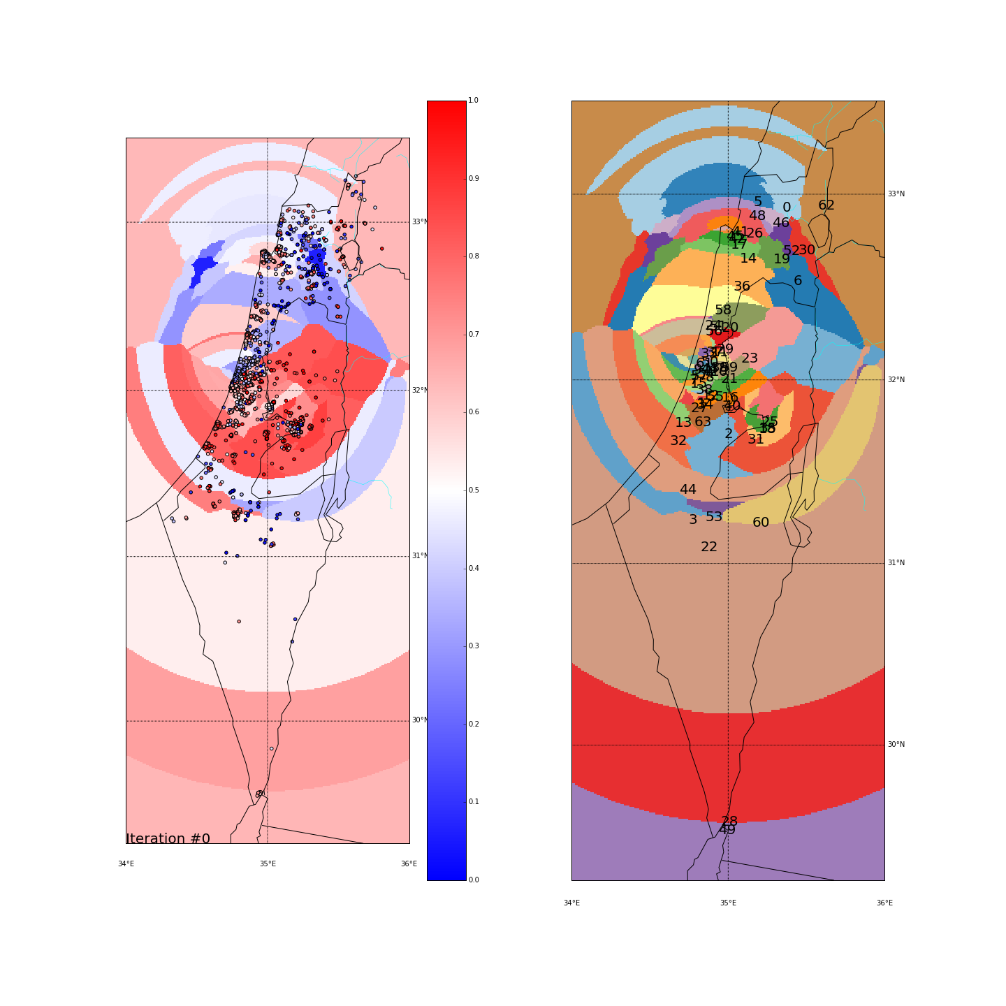
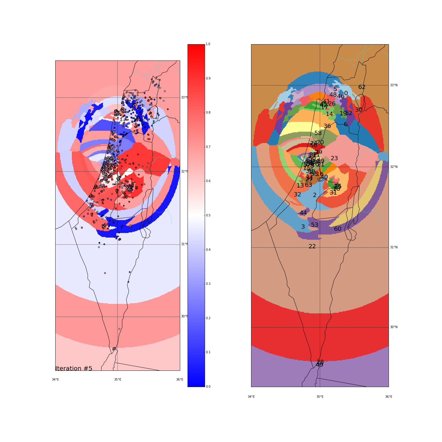
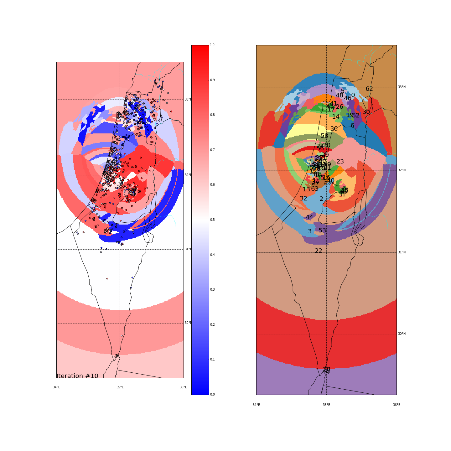
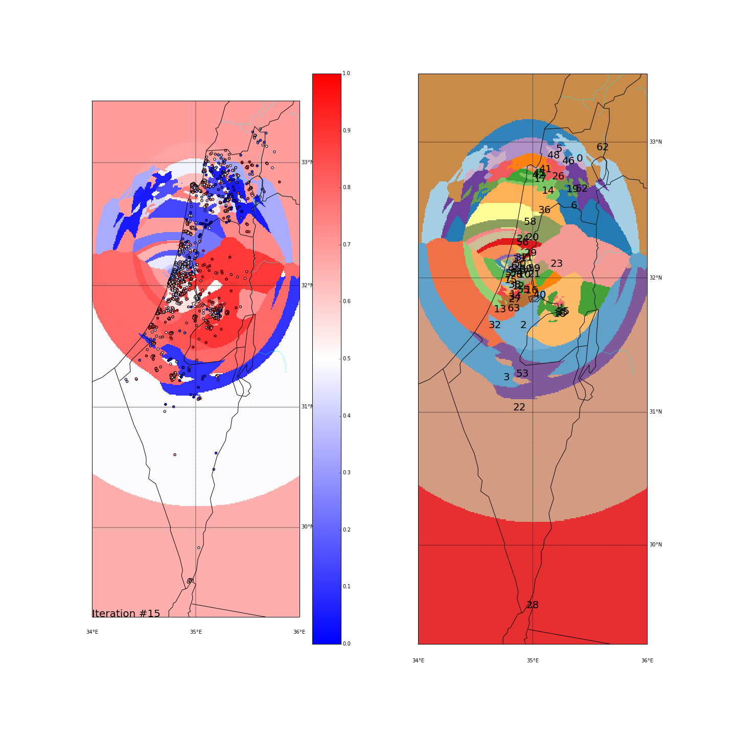
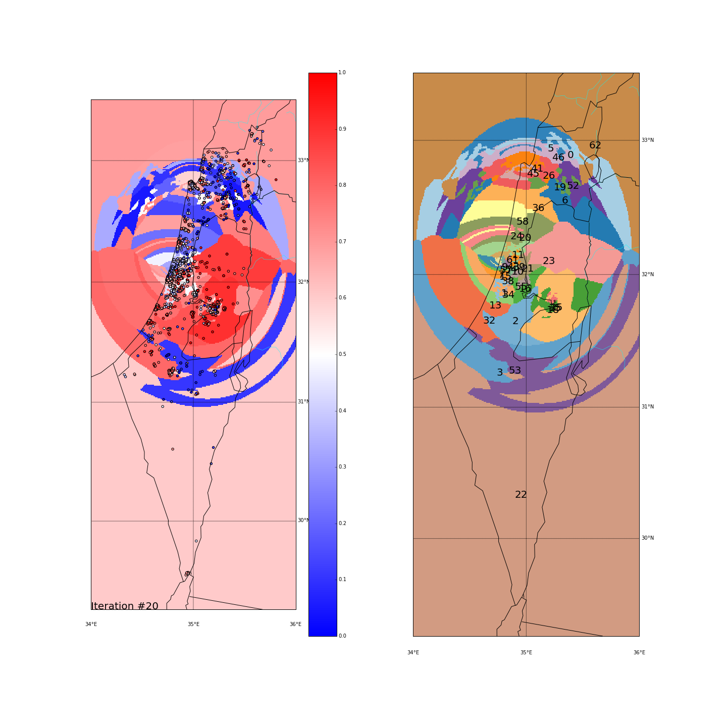
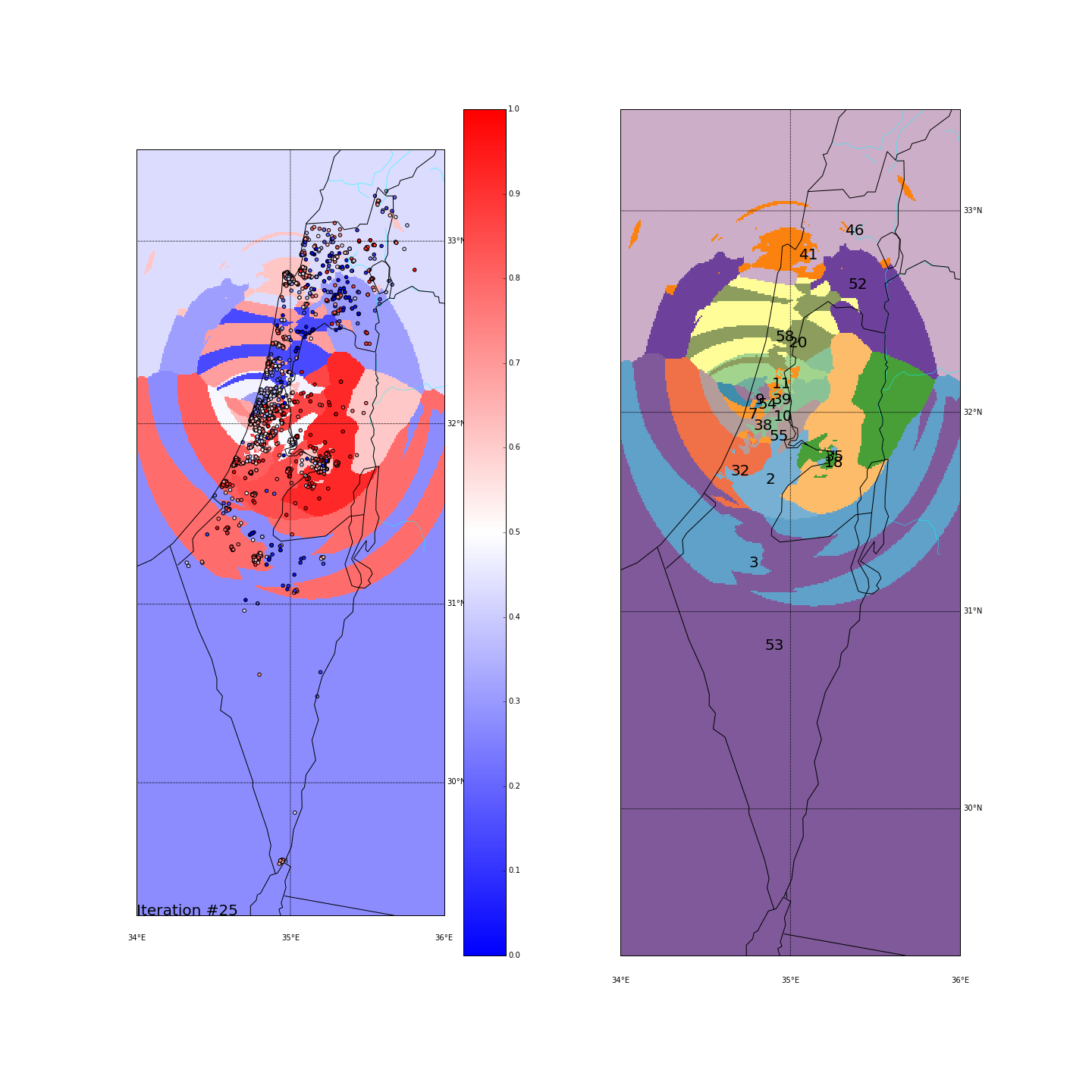
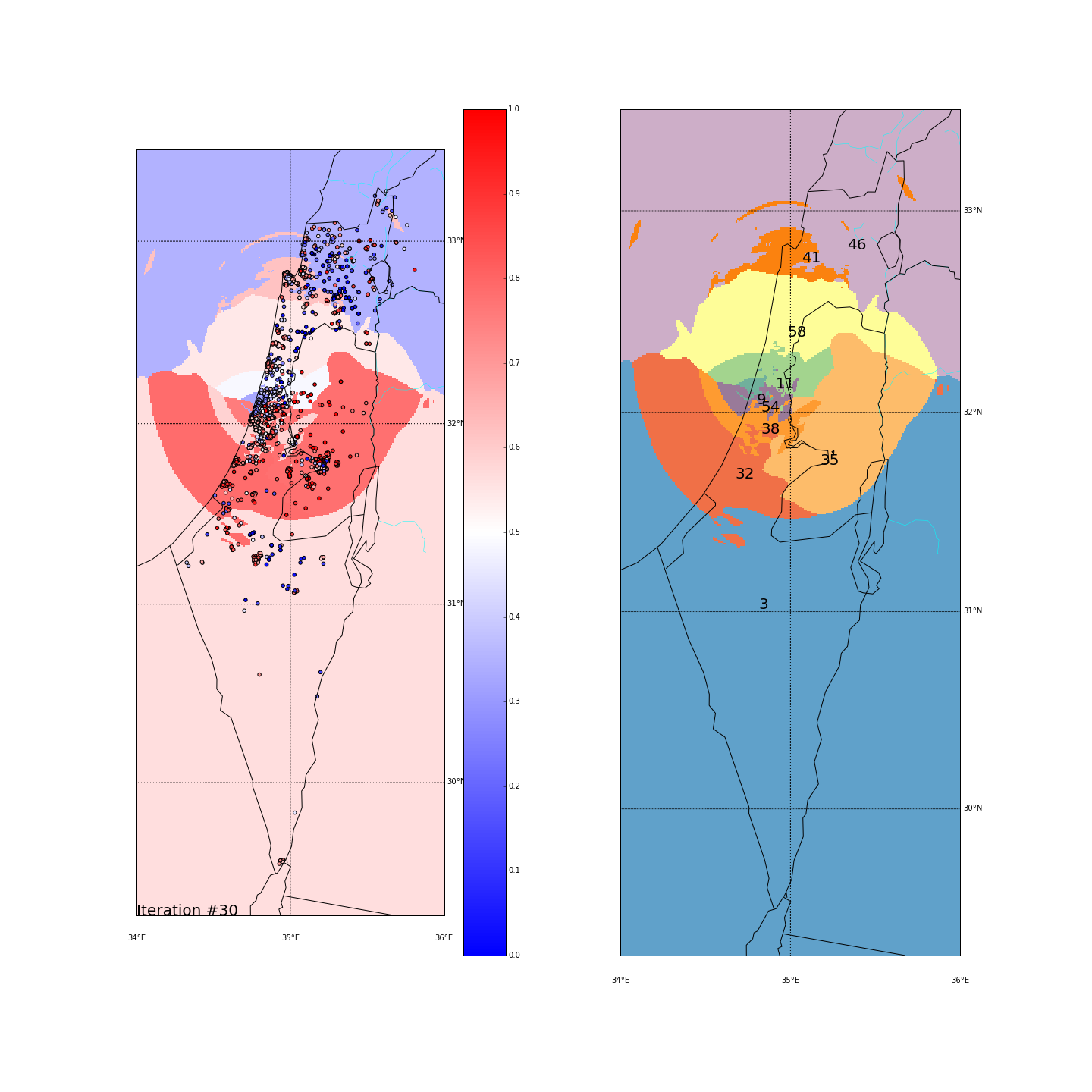
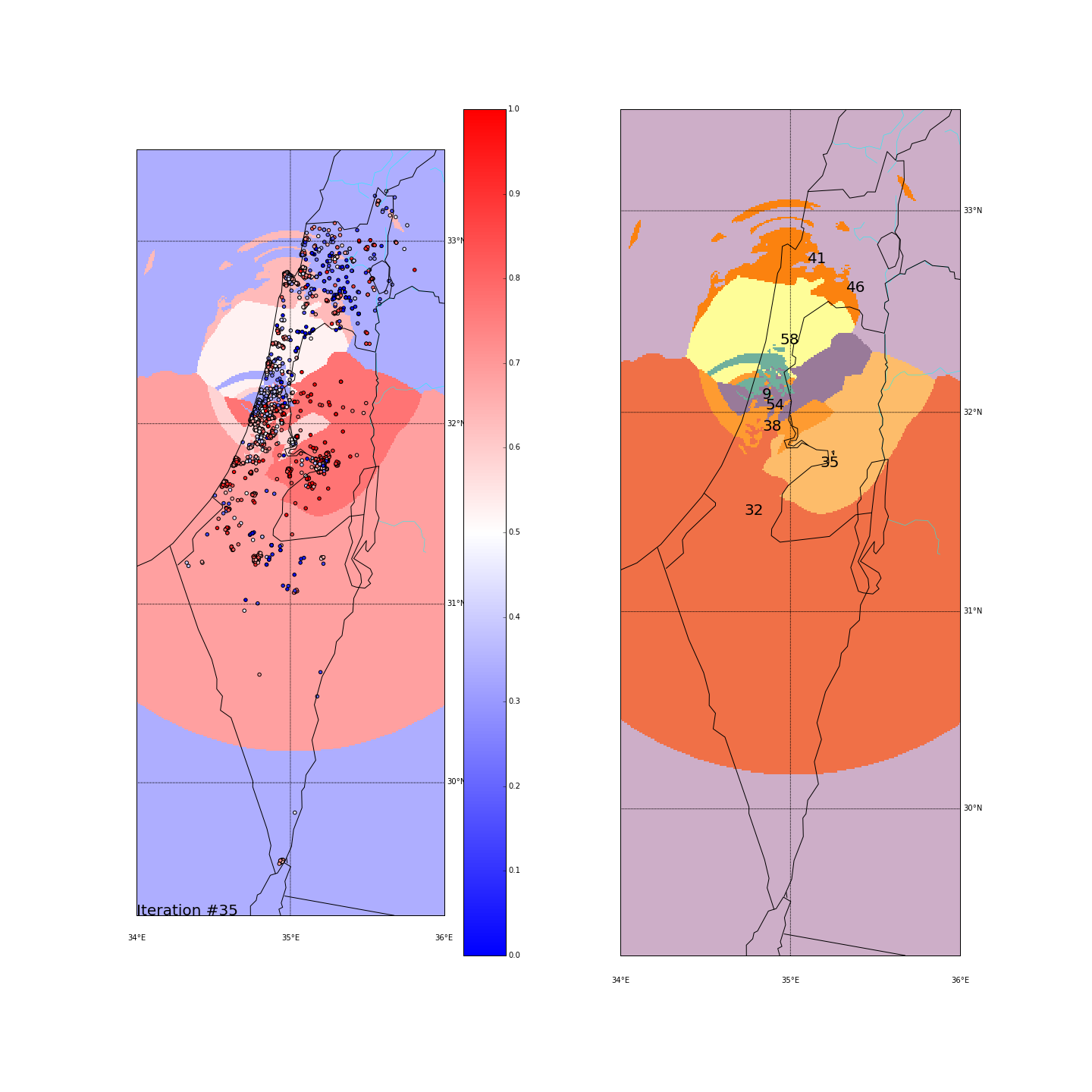
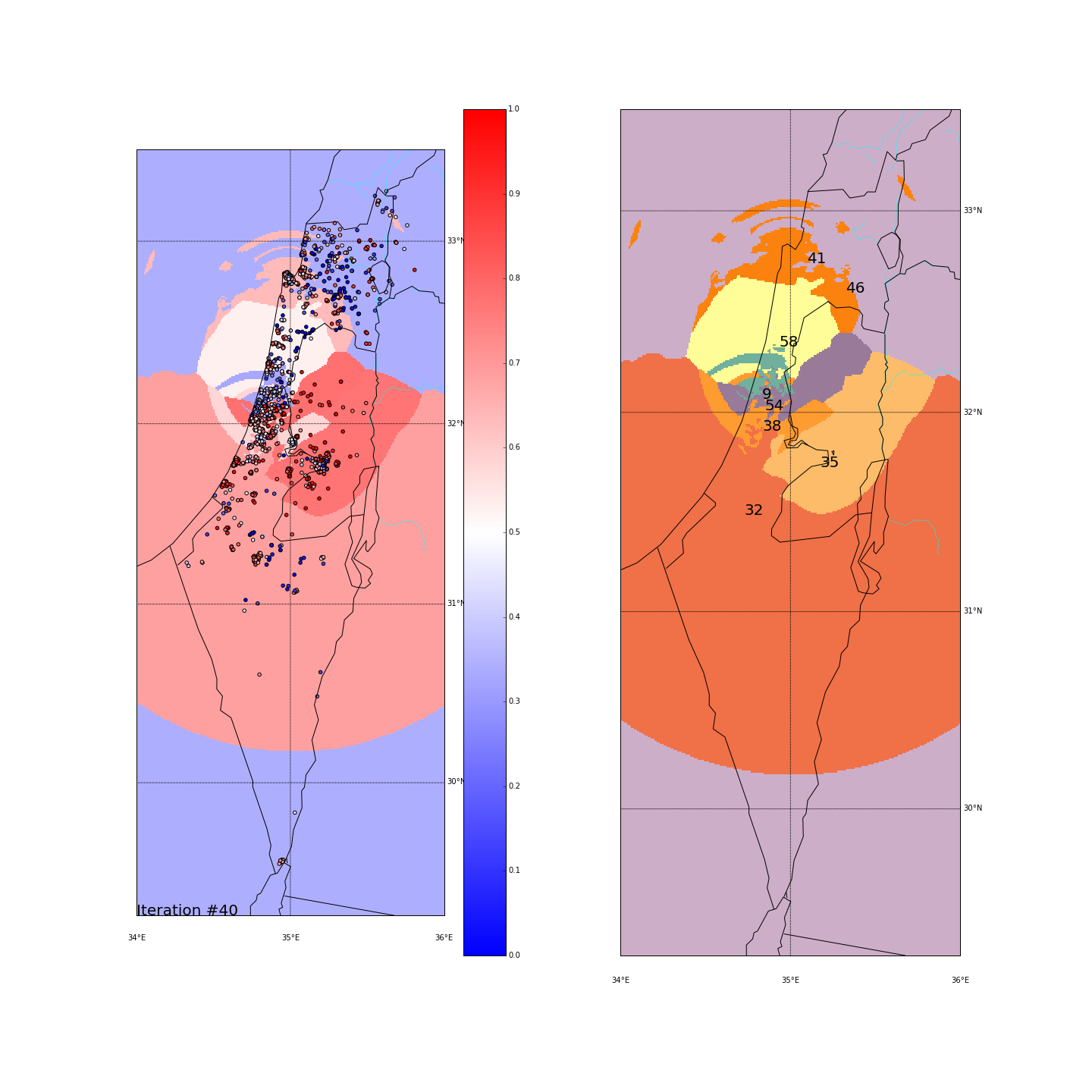
The greedy algorithm will try to cluster the points in an iterative process, where in every step, boundaries between clusters can “migrate” to the adjacent cluster if it’s more similar to their side_score. By migrating, they will obviously affect the average side_score of the cluster, and might cause others to join or leave the cluster in the next round. The whole process stops when it converges (no-one moved) or after a maximum of 75 iterations. We’ll also start with a high number of clusters and then slowly reducing their number, forcing small clusters to join bigger ones.
- Start with a random assignment of K points as clusters centers
- Assign the rest to the closest center
- While we didn't converge (max=75 iters):
	- Identify clusters boundries (explained later)
	- Assign every edge-point to either its current cluster or the one it's
	  adjacent clusters based on the average side_score and the
	  distance from it (explained later)
	- Vanish small clusters, assigning their points to one of the adjacent
	  clusters (explained later)
	- Check if we converged
Identifying cluster boundaries
To identify boundaries between clusters, every point is assigned with the closest point that is in a different cluster. Then, for every ordered pair of clusters, we take the top X points with the minimal distance.
Points migration between clusters
At every iteration, we assign every point to one of its potential clusters. The potential clusters for a point are:
- It’s original cluster (meaning - no migration)
- An adjacent cluster - If the point was one of the boundary points between two clusters
| We basically want the cluster with the average side_score that is closest to the points score. However, the distance from the cluster also affects the choice. The actual formula that we minimize is: \[ \left | SCORE_P - AVGSCORE_C \right | \times 2^{\frac{ d(\verb | P | , \verb | CLUSTER | ) * \verb | SPACE_DIST_TO_KM | }{\verb | NORMAL_RADIUS | } - 1} \] |
d(P,CLUSTER) is the distance between P to a CLUSTER. It’s defined as the average distance from P to the closest 10% points in CLUSTER. I’ve used this metric rather than distance from the center because I wanted clusters to be more flexible in growing.
SPACE_DIST_TO_KM is the distance in Kms that equals one unit in our space. In Israel, and with (long,lat) space, it’s roughly 102 Km. The distance-from-major-cities space makes this more complicated but I’ll use this as a number of thumb although it won’t be very accurate.
NORMAL_RADIUS is the distance from the cluster for which we’ll compare based on the score difference only. If the point is double that radius, we’ll consider the score difference to be doubled. If it’s half the way, we’ll consider the score difference as half.
Vanishing small clusters
The number of clusters reduces as we iterate. That was inspired by Simulated Annealing. We first choose (randomly) a large number (K_START) of random clusters, let them “stabilize” for a while (INCUBATION_PERIOD) and then start reducing their number to K_END. When we’re done, the algorithm will continue iterating with K_END clusters until it converges (or the max number of iterations is reached).
I’ve chosen a logistic function to get this kind of graph: \[ f(i) = \frac{ \verb|K_START| - \verb|K_END| }{ 1 + e^{0.35(i - \verb|INCUBATION_PERIOD|)} } + \verb|K_END| \]
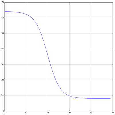
Notice that since we start with a random assignment of clusters, the final outcome might differ between runs. I’ve found the changes to be relatively minor, but they do exist. Starting with a large number of clusters helps reducing the differences as we are then less prone to a “bad random” at the beginning.
Clustering the ballots
First, you can move the slider below to see the “cluster-formation” process, starting from many random clusters and gradually reducing to 8. The left plot are the ballots themselves (color indicating the side_score). The background is the cluster’s average side_score. On the right plot, for easier orientation, there is a plot with the same clusters but the background goes according to the cluster_id. The cluster_id itself is also annotated on that graph.
Clustering on the (long,lat) space
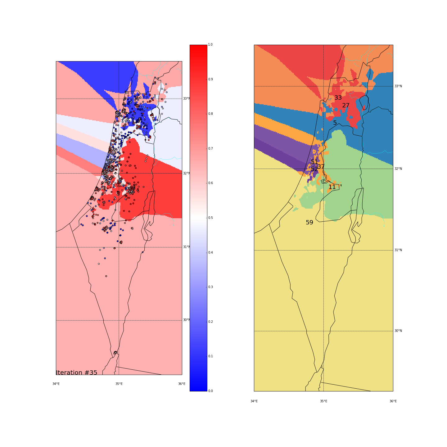
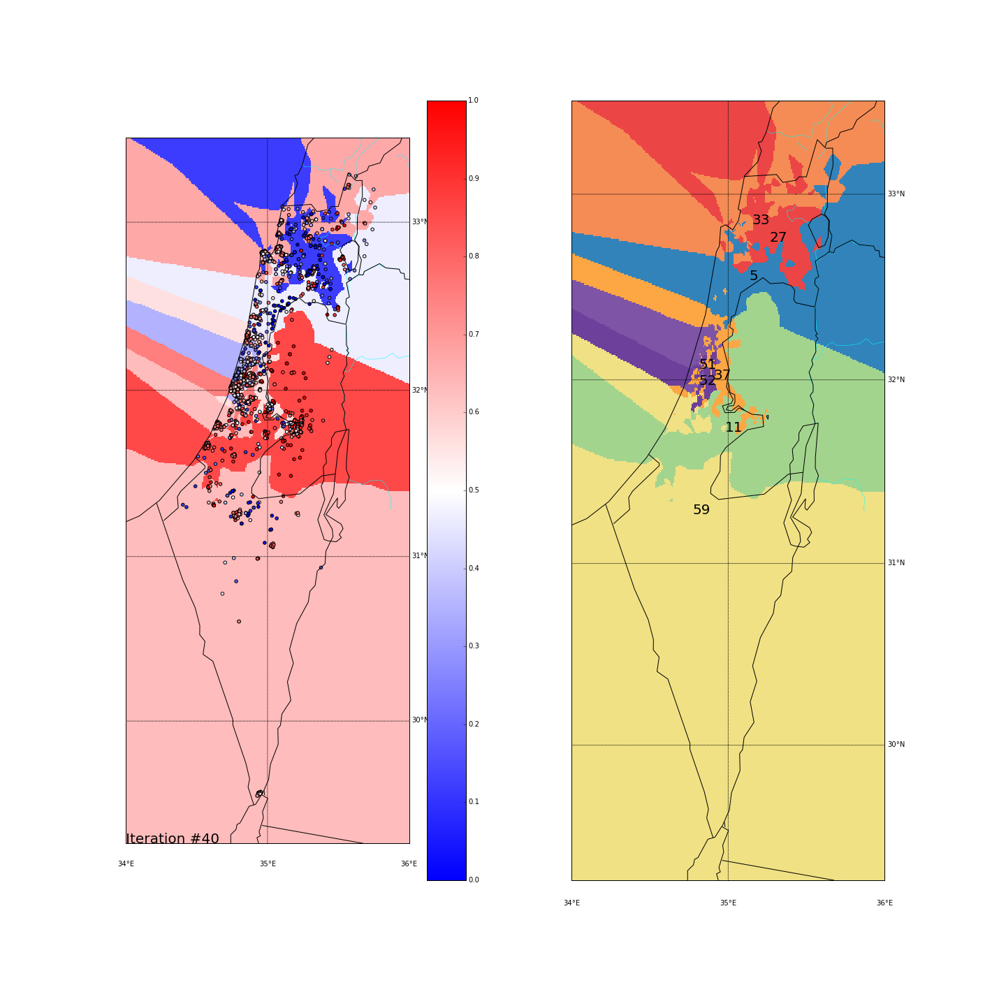


| Cluster_id | long | lat | % Ballots | AVG(side_score) | STD(side_score) |
|---|---|---|---|---|---|
| 5 (blue) | 35.142695 | 32.587410 | 0.109563 | 0.466736 | 0.306480 |
| 11 (green) | 34.969422 | 31.744609 | 0.147045 | 0.848265 | 0.175472 |
| 27 (red) | 35.270609 | 32.793743 | 0.085055 | 0.119388 | 0.168696 |
| 33 (orange) | 35.160177 | 32.887899 | 0.114849 | 0.669161 | 0.182232 |
| 37 (light orange) | 34.910388 | 32.053138 | 0.178760 | 0.557992 | 0.162565 |
| 51 (light purple) | 34.819789 | 32.110159 | 0.113888 | 0.350455 | 0.103276 |
| 52 (purple) | 34.820638 | 32.025495 | 0.136473 | 0.766643 | 0.134567 |
| 59 (yellow) | 34.787554 | 31.323720 | 0.114368 | 0.616488 | 0.284753 |
Final AVG(STD(side_score)) was 0.189
Clustering on the major-cities-distance space

| Cluster_id | long | lat | % Ballots | AVG(side_score) | STD(side_score) |
|---|---|---|---|---|---|
| 9 (turquoise) | 34.835968 | 32.115069 | 0.116771 | 0.329503 | 0.118400 |
| 32 (dark orange) | 34.735766 | 31.536307 | 0.160980 | 0.683800 | 0.277369 |
| 35 (light orange) | 35.180314 | 31.775528 | 0.106679 | 0.770323 | 0.219718 |
| 38 (orange) | 34.842189 | 31.961982 | 0.110524 | 0.579779 | 0.177723 |
| 41 (another orange) | 35.101133 | 32.792353 | 0.114368 | 0.634113 | 0.204554 |
| 46 (light purple) | 35.330796 | 32.645684 | 0.141759 | 0.341637 | 0.328693 |
| 54 (dark purple) | 34.857213 | 32.059259 | 0.148486 | 0.773695 | 0.151286 |
| 58 (yellow) | 34.939114 | 32.375783 | 0.100432 | 0.528238 | 0.286451 |
Final AVG(STD(side_score)) was 0.220
Comparing two spaces
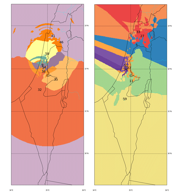
By looking on the final results from both spaces, we can notice the following:
-
The Galilee area - In both spaces it gets divided between arab villages (left wing voters) and the cities of Haifa, Acre and Nahariya which tend to vote more to the right-wing parties. In the maj-cities space, Haifa practically got its own cluster (being one of the major cities we measure distance from) and grouped together everyone who votes like it.
-
Jerusalem and Judea&Samaria - An obvious cluster that groups together voters from the right side of the political map. Here we see a split in the maj-cities distance, probably because Jerusalem too is one of the major cities and grouped harder the surrounding points. The rest just formed another cluster with similar characteristics (#35 and #54). A nice thing to observe is that in the long-lat space, the Jerusalem cluster (#11) “uses” Beit-Shemesh and Kiriyat-Gat in order to expand itself into the cities of Ashdod and Ashkelon which as we’ve seen at the beginning, are very red as well.
-
The Negev - A large area with mixed red/blue ballots scattered all over. In the long-lat run it was all clustered together, causing this cluster (#59) to be very heterogeneous (STD of 0.28). In the major-cities run, it was actually grouped together with some ballots up in the north (remember we project all points on the “distance from Tel-Aviv-Haifa-Jerusalem” dimension). That again created a mixed cluster (#46) with STD of 0.32.
-
Tel Aviv - It seems like we have a winner here. Both runs “dedicated” a cluster for Tel Aviv and the surrounding cities (Herzeliya, Kfar Shmaryahu and even Ra’anana and Kfar Saba). Tel Aviv has managed to tear apart its southern neighbors (more associated with the right wing parties) and the adjacent southern cities (Holon and Bat Yam) although they are only a very few Kms away and join Raanana and Kfar Saba (~20 Kms away) to form an impressive homogeneous center-left cluster: in both runs the STD of the TLV cluster is ~0.1 (and is the lowest of all clusters!) while the average side_score is ~0.35 which represents a nice mixture between left and center parties. In both runs, by the way, the number of ballots in the TLV cluster was around 11%.
Conclusion
Well.. not sure if it’s good or bad, but it seems (like we kind of knew before) that we do have a mass of center-left voters around TLV while the surrounding areas are dominated by right-wing voters. As I stated at the beginning, that itself is not a surprise and the whole point of this post was to try to come the other way around: instead of calculating statistics on ballots in TLV and showing that they differ from the average in the country (which is easy and expected), I wanted to run an unbiased algorithm that will try to cluster points together in order to form homogeneous clusters and see if it naturally picks Tel Aviv or not. I think that went well but there are some issues to deal with in future posts (well.. when I have some time..).
AIs - Future Ideas
-
Center-based clusters don’t fit geographical data well - DBScan to the rescue(?) - I had this problem since the beginning, tried to overcome it by transforming to what I though would be a better dimension (the major-cities-distances). It indeed formed ‘nicer’ clusters with pure KMeans (in my opinion) but didn’t help much with the greedy algorithm. When ballots have to ‘choose’ which cluster to join, they do it based on the average score and the distance from the cluster. When I did it based of the distance from the center, the results were very scattered (since pretty fast, all points are considered very far away and migrate easily to clusters that don’t fit them score-wise). I moved to measuring distance from the edges of the clusters, which helped a little, but still, as can be seen in the final outcomes - not ideal. I’d want the clusters to grow more naturally based on the closest points to them, trying not to ‘cut’ other clusters in the way. DBScan seems like a good start and I’ll definitely try it.
-
Multi-Dimentional scoring for parties - It was clear from the beginning that we can’t project the complex political world on a single axis. I just wanted to make my life easier (both calculating and visualizing) handling only a single number per ballot and not a vector. Seems very interesting to see how social/religious/economical clusters look like.
-
This all should be treated as an optimization problem - We have around 10K points with a score, we have to assign a number from 0 to 7 to each so that we get the lowest AVG(STD) of scores and clusters are geographically close (a measurement based on the X closest neighbors from the cluster will probably be sufficient). I’d also add as a lesson, that we want to penalize points that are surrounded by another cluster (more than X% of their neighbors are from a different cluster) and maybe add some more constraints. The best AVG(STD) I got with the greedy algorithm is
0.189and since I always got slightly different results, it’s pretty obvious that it converges on local minimums. Would be interesting to try a totally different approach and see how better is it from the naive algorithm.